What Emotions Do Your Brand's Colors Invoke?

When defining and designing your brand, there are about a thousand different factors you must consider.
What words to say? What images to pick? What font to use? The questions just keep coming.
However, to the consumer, there is one thing that stands out amongst the rest...
COLOR
Intro to Color Theory
Think about this:
Which word group invokes more emotion?
"Joy, Love, Happiness, Safety, & Peace"
OR
"Rust, Air Compressor, Coffee Cup, & Laundry Day"
Let's hope you went with the first one. The rest of the article depends on it.
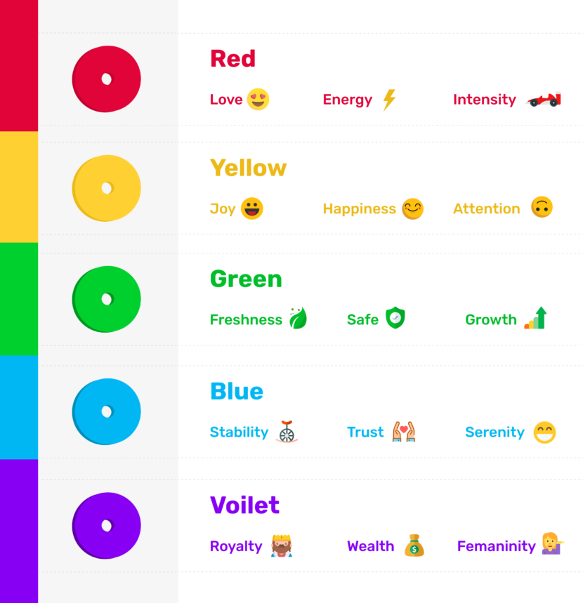
Emotion plays an incredibly effective part in our decision-making process. We make a myriad of micro-decisions based on emotion alone, and so do your customers. You, as a brand, don't have the time of day to tell your whole identity to a potential client.
So logic follows that we have only a few milliseconds to introduce, and convince a client to trust our brand.
Antionio Damasio performed a study that asserted that humans made split-second decisions based on emotion. One of the factors of the study focused on those with damaged "emotion" centers in the brain had a much harder time making decisions. Isn't that interesting? One of the powerful inferences from this study concludes that humans do in fact make decisions based on emotion over logic, a good amount of the time.
So when we consider our logo, our window to our brand, we have just a few milliseconds to impact the client. And the first thing that makes that impact is color.
Picking Your Initial Color
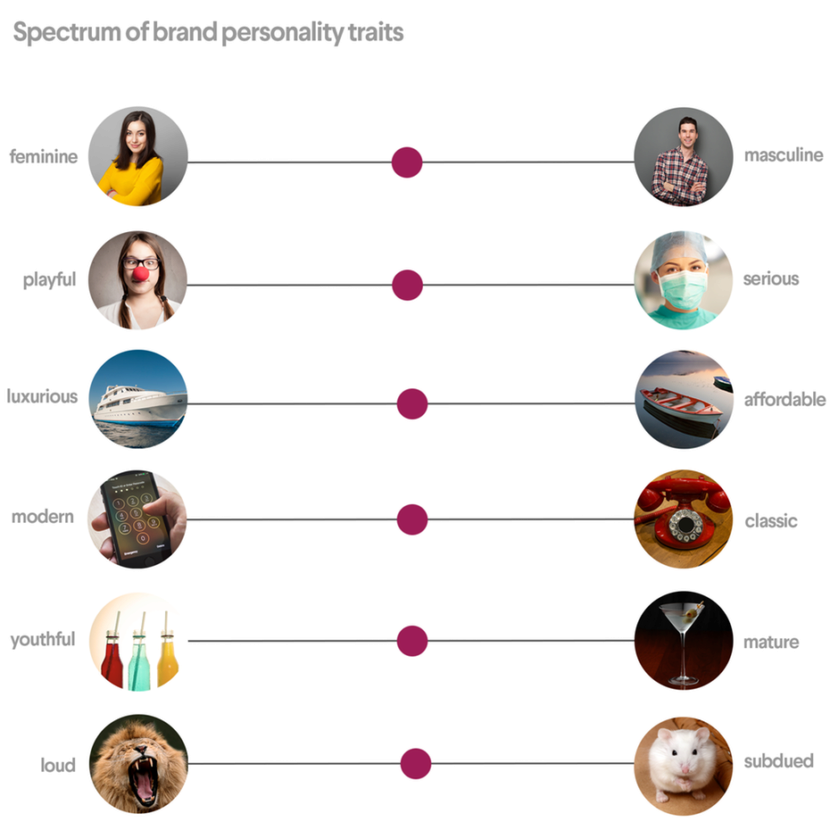
First, let's establish (or identify) your brand's personality.
The chart on the left (or above, on mobile) will assist in helping you define your personality.
Do you sell rugged, pricey watches?
Masculine / Serious / Luxurious / Classic OR Modern / Mature / Loud
Do you build apps?
Masculine OR Feminine / Playful / Affordable / Modern / Youthful / Loud OR Subdued
Now that you've determined your general personality for the brand, let's apply that to picking your initial color.
Do you sell rugged, pricey watches?
Masculine / Serious / Luxurious / Classic OR Modern / Mature / Loud
Blue / Red
Do you build apps?
Masculine OR Feminine / Playful / Affordable / Modern / Youthful / Loud OR Subdued
Orange / Purple
Flushing Out the Scheme
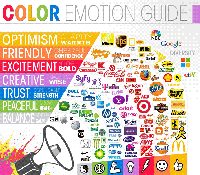
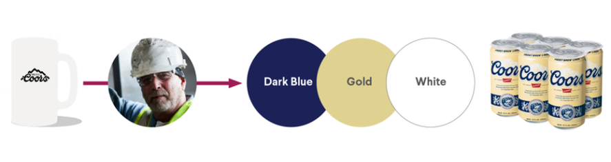
Now that you have identified your brand's initial color, we can begin to fill out the palette. When picking your brand's palette, in general, we want to choose 3 colors:
- PRIMARY COLOR
- SECONDARY COLOR
- NEUTRAL COLOR
When considering your secondary color, not only do we want to consider colors that invoke the same emotion tied to the personality of our brand, but also colors that are visually pleasing as well. This is where more color theory comes in. For this, we'd like to recommend some amazing websites to help.
Your neutral color is a third helpful accent, that fills negative space and gives a depth to the brand. Notice the Coors Banquet example below.
Color Inspo
Full service tool with color schema, external tools, brand color schemes, and more!
Paletton
Color scheme generator that's useful for finding colors to accent your primary and secondary (for UI/UX motion as well).
Coolors
Need a quick color scheme idea? Coolors is great at that! Really great for those low inspiration moments.
Wrapping Up
Now of course, this method is merely a suggestion, not a steadfast set of rules. Always let your creativity and mindset help guide you in picking your brand's color scheme. Emotional Connection was the point we made earlier when it comes to decision-making and colors. So at the end of the day, if it doesn't feel or look right to you, listen!