
The Lost Art of Typography

Zachary Bowman
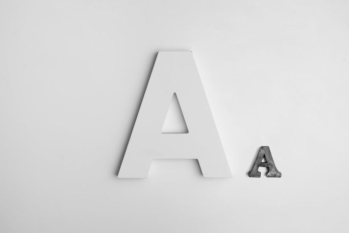
Is Typography really "lost"?
Well, no! Of course not! But it's being streamlined so much that it's definitely being forgotten about. Just a few years ago, when you began designing a website, choosing a font-family was just as big of a decision as whether using React or Vue. Now, with the optimization of so many CMS platforms out there, getting a website up and running is as easier as ever. However, I'm noticing a trend as websites are being made by more and more people. Typography is being forgotten about. Words make up about 95% of the what comprises a website and since language is our most effective medium of communication, logic follows that the design of our words has an argument to be the most important aspect of a website. Let's touch up.
What is Typography?
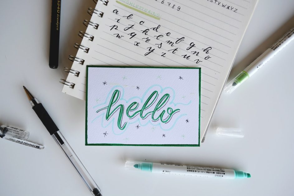
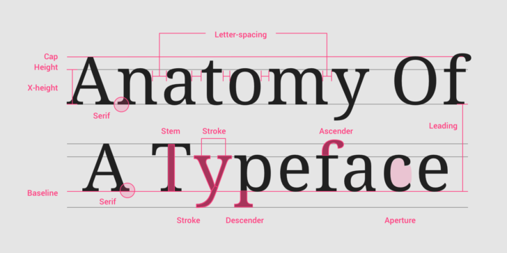
Google's Material Design Framework asserts that Typography "expresses hierarchy and brand presence". Wikipedia defines it as "the art and technique of arranging type to make written language legible, readable, and appealing when displayed". Font size, letter spacing, font weight...just a few of the variables we have the power to tweak in regards to our mission of making the words themselves as much as an art as the color, layout, theming and media on a website.
Typeface
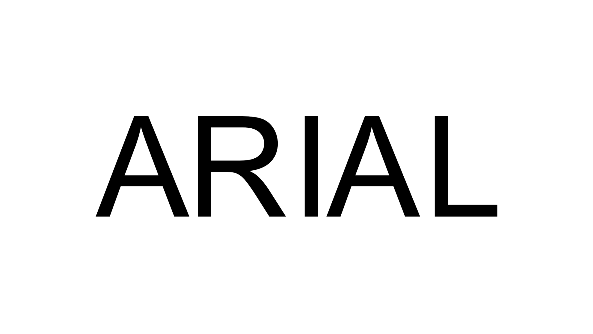
A lot of creators confuse the basics of typography. On the most basic level, we have the difference between Typeface and Font. A Typeface is the full collection of lettering, symbols and glyphs, such as Arial, one we all know and love. When people think of "fonts", they truly are thinking of Typefaces.
Font
Fonts, however, are specific variations of typefaces. For example, Arial is a typeface, but Arial (fontSize: 12px; fontWeight: bold; letterSpacing: 2px) is a font. Colloquially, font is used interchangeably between the two, but it is good to know the true differentiation.
Font Styles
There a quite a few variations of type of fonts. Broadly, they are categorized into 4 types:
- Serif
- Sans Serif
- Script
- Decorative
Serif
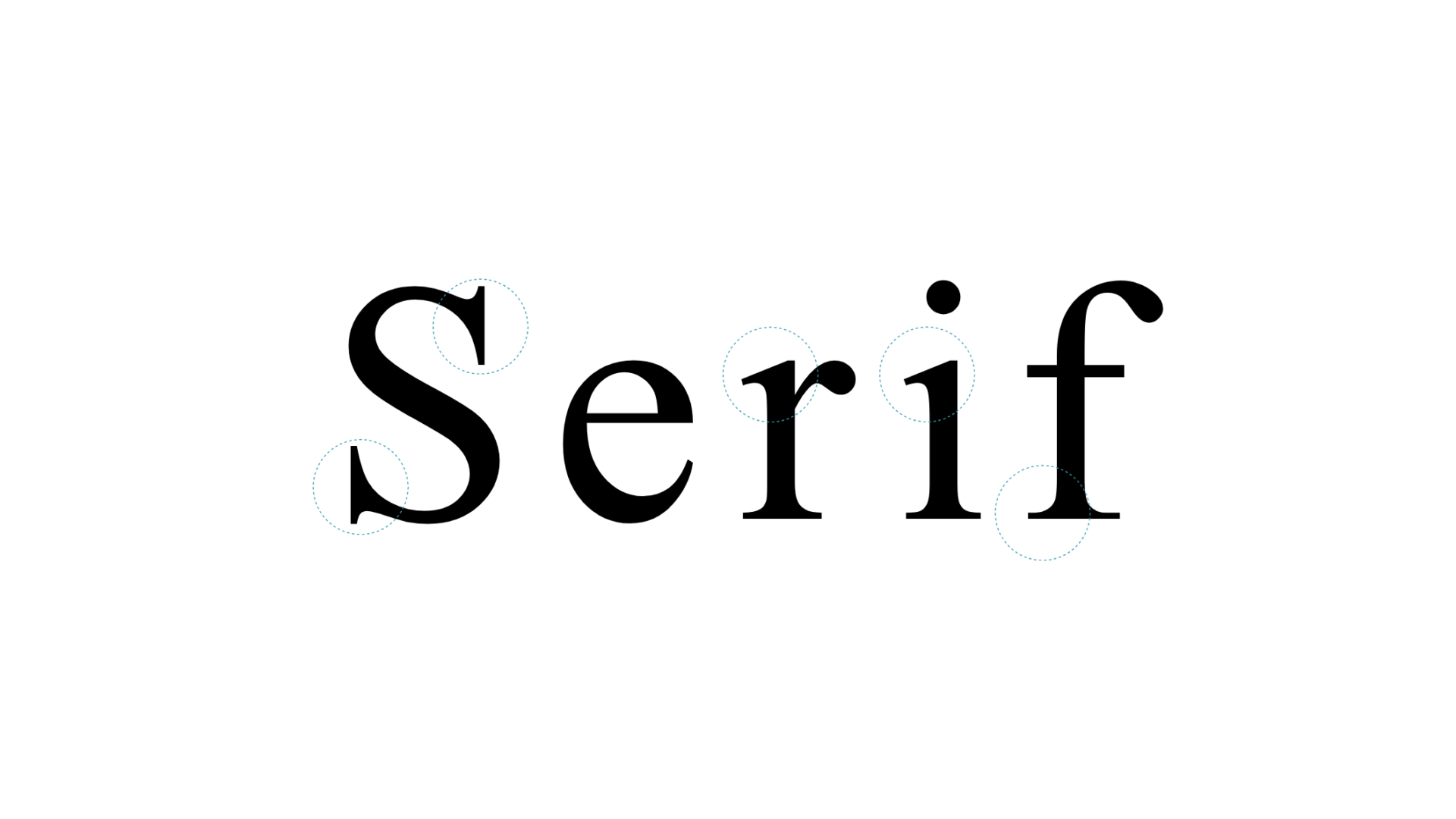
A "serif" is a small stroke at the end of a larger stroke of lettering. Serif fonts convey maturity, elegance, authority and strength. Serif fonts are some of the oldest with the first going back to the Roman era. The Serif subcategories include:
- Old Style
- Transitional
- Neoclassical
- Slab
- Clarendon
- Glyphic
Sans Serif
Simply put, sans serif fonts do exactly what they say. Sans serif fonts leave out the "serifs" on the larger strokes in the lettering. Sans serif fonts are all the rage right now in web design. They convey feelings of modernity, youth, light-heartedness, and sleekness. Sans serif subcategories include:
- Grotesque
- Square
- Humanistic
- Geometric
Script
Script styles are based on 17th century handwriting styles, with long flowing lettering that often connects to its neighbors by long strokes. Script styles are used to convey elegance, class, humanism, and grace. Script has several subcategories such as:
- Formal
- Calligraphic
- Lombardic
- Casual
Decorative
The final font type is reserved for lettering not intended to be used in long type. Signs, banners, logos, messages and more can employ the decorative font type to convey personality, fun, youth, joy and creativity. Decorative scripts are great as they capture the culture of the time, such as graffiti style, and can either be good or bad as they fall out of style with time.
Lesser Known CSS Typography
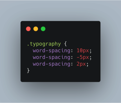
word-spacing
- Sets how far apart the words in a block are spaced
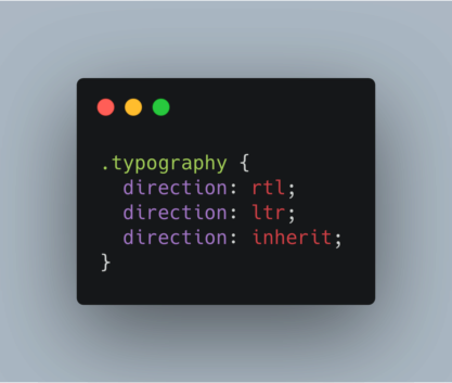
direction
- sets the direction of the typeface being used, or the font
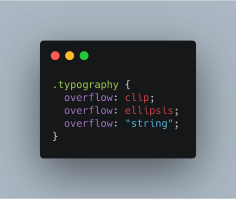
text-overflow
- sets how the text should behave when overflowing out of its parent container
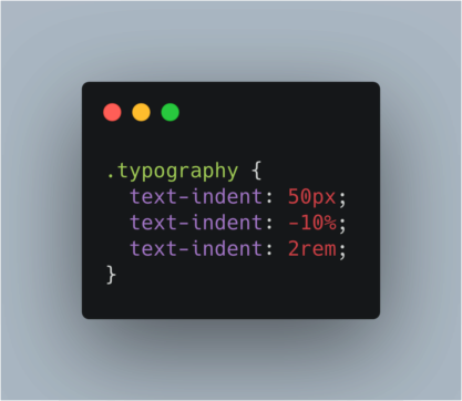
text-indent
- sets how the first line in a block of text should behave
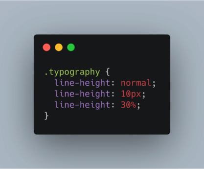
line-height
- specifies the height of each individual line in an element
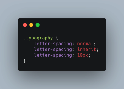
letter-spacing
- increases or decreases the length between each character

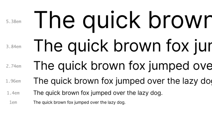
Refreshing CSS Measurements
Tables borrowed from W3 Schools
Absolute Units
| Unit | Description |
|---|---|
| cm | centimeters |
| mm | millimeters |
| in | inches |
| px | pixels |
| pt | point (1/72 of 1 inch) |
| pc | picas (1 picas = 12pt) |
Relative Units
| Unit | Description |
|---|---|
| em | Relative to the font-size of the element (2em means 2 times the size of the current font) |
| ex | Relative to the x-height of the current font (rarely used) |
| ch | Relative to the width of the zero(0) |
| rem | Relative to font-size of the root element |
| vh | Relative to 1% of the height of the viewport |
| vw | Relative to 1% of the width of the viewport |
| vmin | Relative to 1% of viewport's smaller dimension |
| vmax | Relative to 1% of viewport's larger dimension |
| % | Relative to the parent element |
Source: CSS Tricks
Source: Material Design
System Fonts v. Installed
System fonts come pre-installed on all devices. They are great for developers because they maintain confident uniformity across devices, and there is no additional cost for developers to install them.
However, their biggest advantage is also their biggest disadvantage. Their widespread use gives way to a lack of individuality in using System Fonts without the accents of additional fonts.
When it comes to installing external fonts, you have a few options.
First, you can buy any font and upload it to your website!
Paid Font Services:
However, you needn't pay for all fonts!
Google Fonts is an amazing, free tool for installing CDN hosted fonts that you can use for free.
click here to go to google fonts
Wrapping Up
Typography is an art that merits a much longer conversation than this simple blog post. However, hopefully it sparked your interest in refreshing on our most basic of practices. As design systems and CMS platforms get more and more mainstream, we must challenge ourselves as creators to keep our chops on the basics, for they carry the undercurrents of design that have existed for centuries. Stay tuned for more posts digging into design a bit deeper!
https://ia.net/topics/the-web-is-all-about-typography-period
https://en.wikipedia.org/wiki/Typography
https://www.fonts.com/content/learning/fontology/level-1/type-anatomy/type-classifications